Gimono Fightwear Brand Signature, Application and Packaging
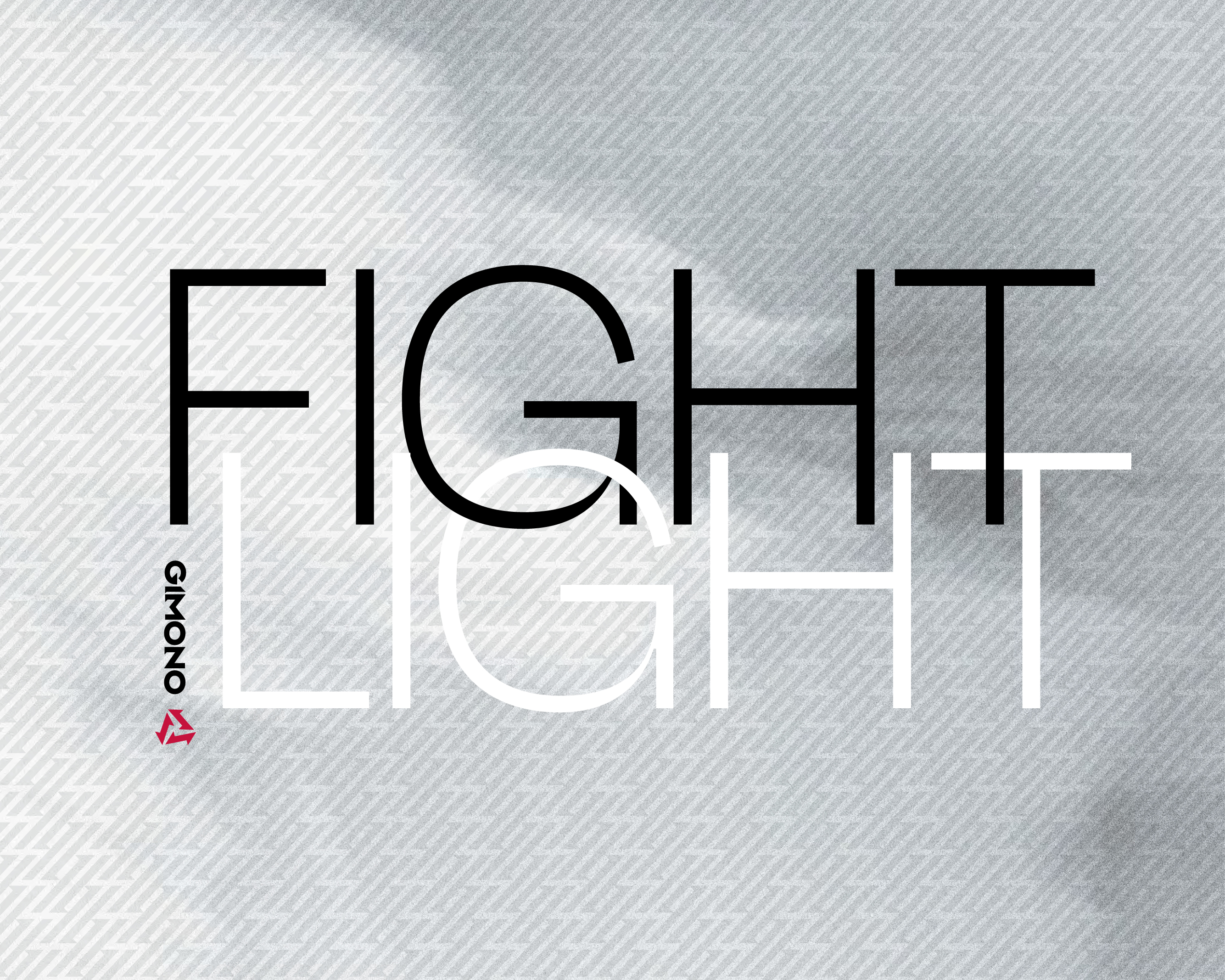
When the fight has got to be light.


How do you represent fluidity, the nature of martial arts, the cultural origin and energy all in one symbol?
Client
Gimono Fightwear Brand Signature, Application and Packaging
Project
Brand Development and Packaging Design
Location
Arrowtown, New Zealand
Year
2008
-
2008
Role
Creative Director
Agency
DNA
Category
Performance Sportswear
Contributors
Grenville Mian – Strategic Oversight
Christine Ardern – Client Lead
Lavinia Calvert – Key Client
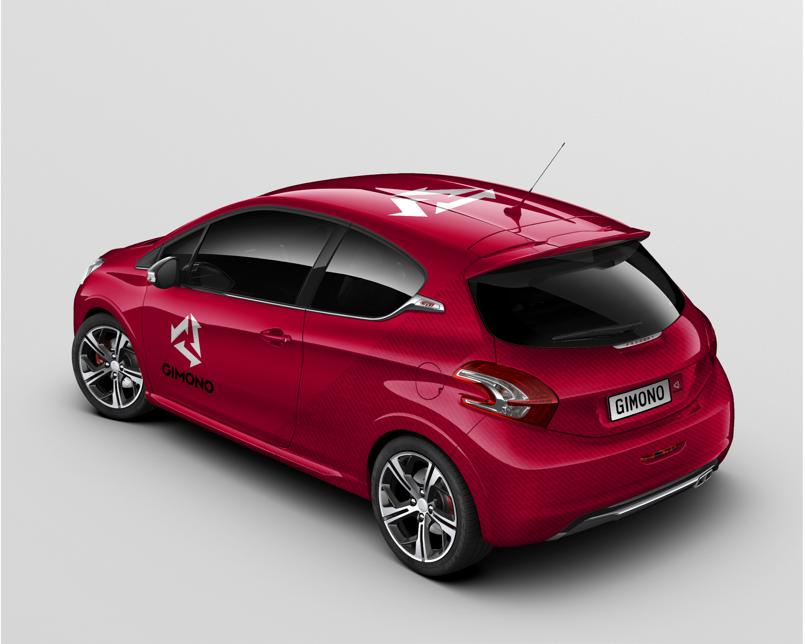
Gimono approached us with a clear ambition: to build a brand around a breakthrough in martial arts apparel. They had developed a revolutionary new judo and karate gi using an innovative dual-layer fabric that was lighter, more breathable, and resistant to the sweat-soaked heaviness of traditional uniforms. This functional advance offered a genuine performance benefit, but the brand needed to do more than explain a technical feature. It had to express a feeling—of lightness, of freedom, of winning from within.
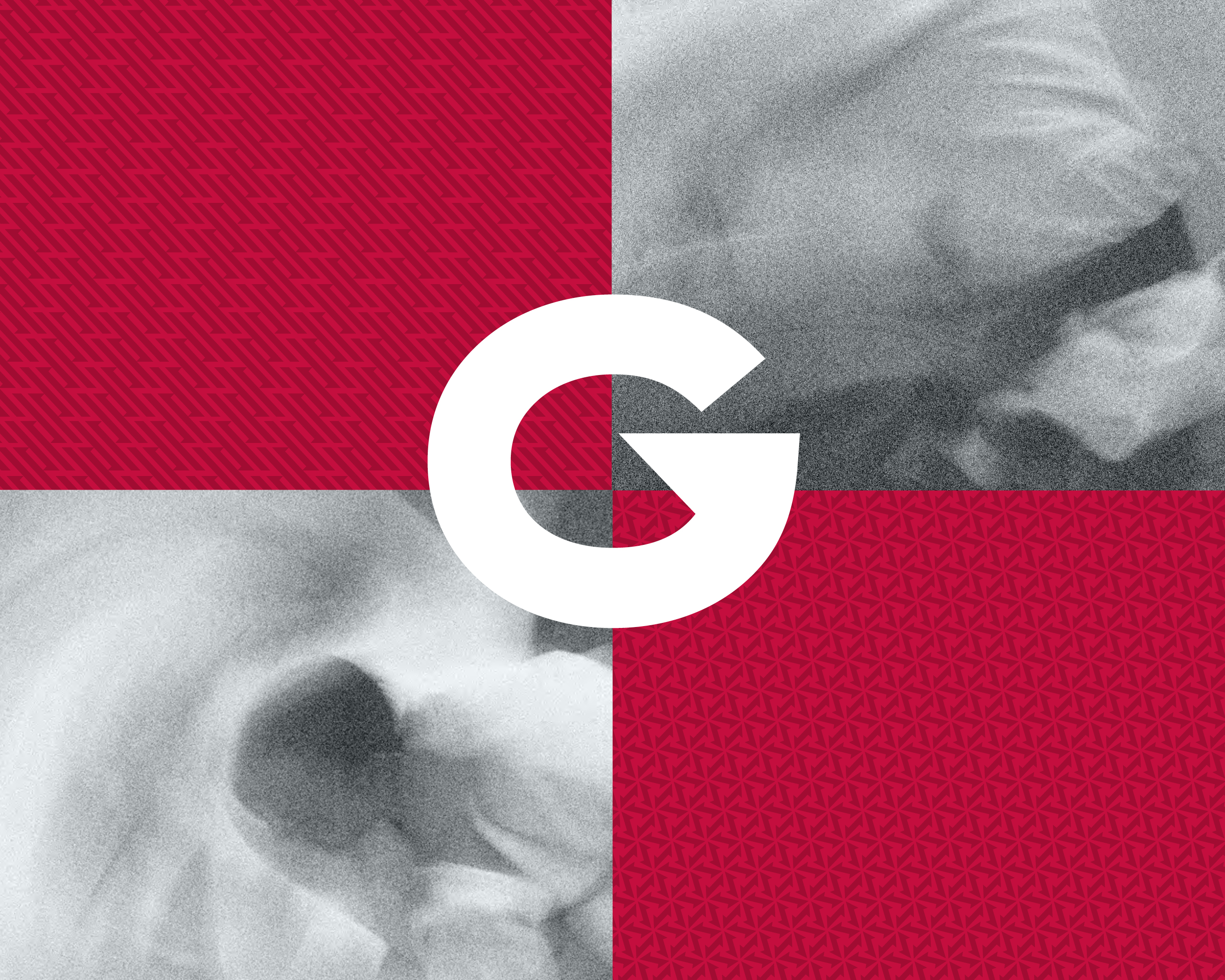
We grounded the entire identity in the philosophy and discipline of judo, drawing on values like respect, patience, and bravery. The visual language reflected the harmony of body, mind, and spirit. The logotype was informed by the geometry of Japanese brush script, while the brand symbol, a stylised ‘G’, suggested both motion and potential. A leaping figure was subtly formed in the negative space, and every element avoided perfect verticals and horizontals, reinforcing a sense of constant movement and quiet power.
This was a brand built on performance but expressed with restraint and clarity. Messaging lines like “Nothing beats how it makes you feel” and “Win from inside” helped translate technical innovation into emotional resonance. The final identity felt purposeful and modern, yet deeply respectful of the traditions that inspired it. It captured the intangible essence of mastery, commitment, and transformation.
The creative process unfolded through careful steps. We worked closely with the client through early concepts, testing and refining options through open consultation. Several iterations explored different approaches, balancing cultural nuance with visual clarity. A final direction was approved and ready for rollout. However, the client later chose to take the project in a different direction. After delays in finalising the production process, the brief was passed to a new agency for market execution. While our work was never formally launched, it served as a valuable proof of concept, and remains a project we continue to take pride in.


More than performance sportswear, Gimono is a feeling; of lightness, focus, and winning from within.


Gimono is a brand built on performance, expressed with restraint and clarity — rooted in tradition, but made for the future.