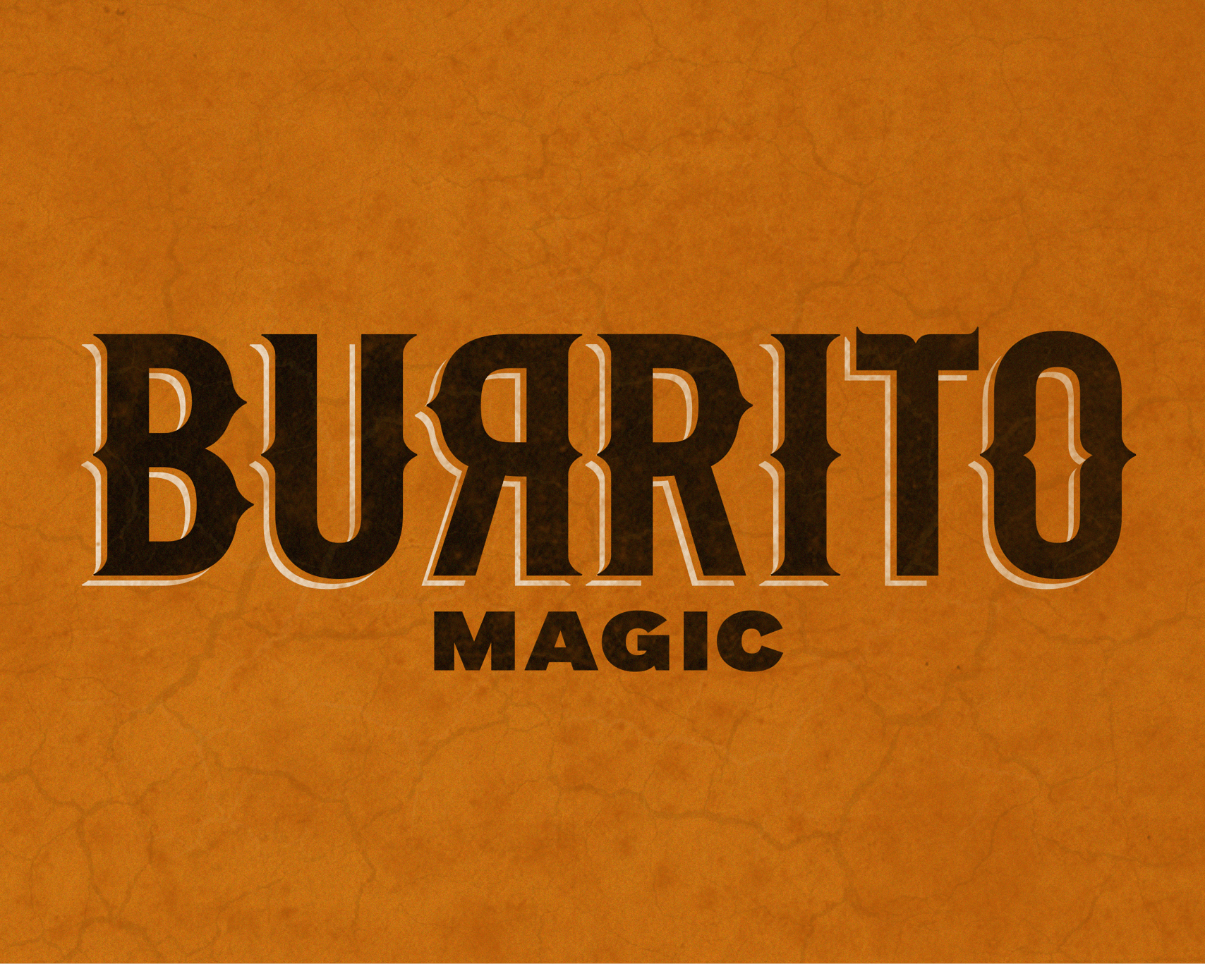
Burrito Magic Brand Identity and Application
Authentically Mexican, but made Kiwi.
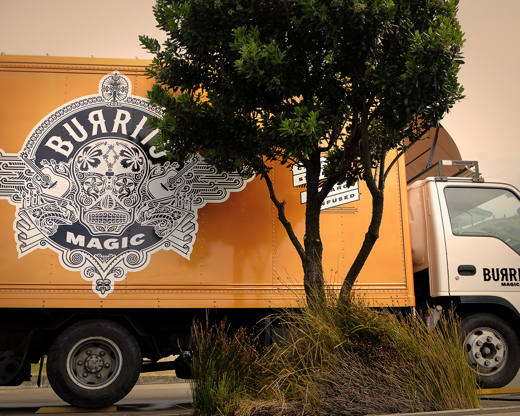
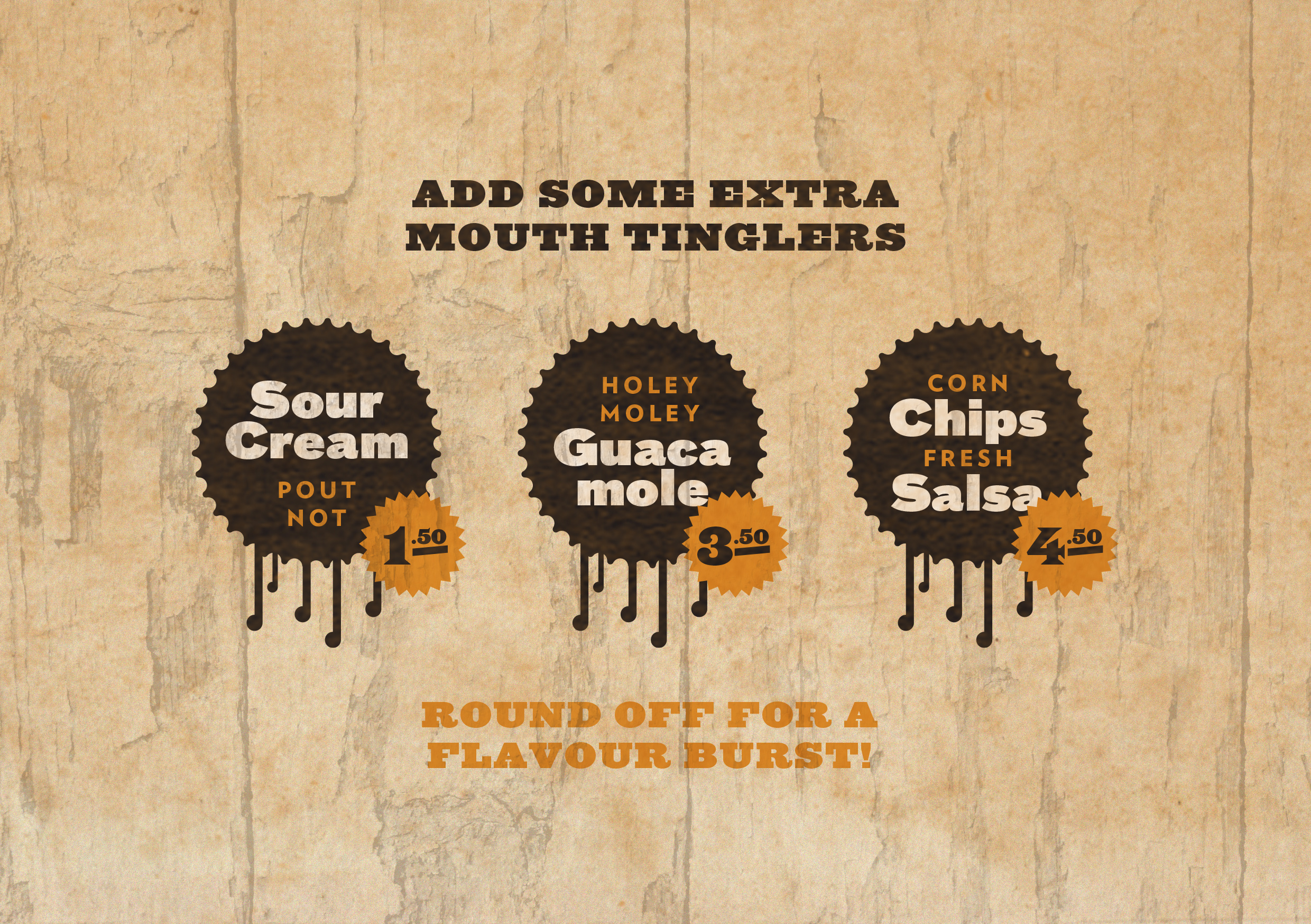
Mexican food carries some pretty instant visual cues — this identity was designed to be unmistakable from across a paddock.
Client
Burrito Magic Brand Identity and Application
Project
Brand creation
Location
Pōneke, Aotearoa
Year
2013
-
Role
Creative Director, Designer
Agency
DNA
Category
Hospitality
Contributors
Cy Besser – Client
Noel Brown – Client Lead
Samuel Sakaria – Logo illustration
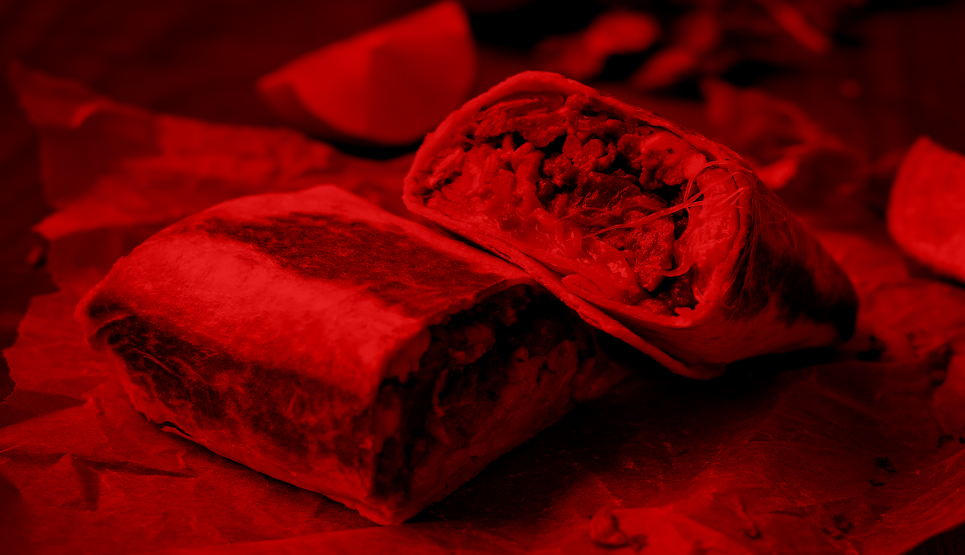
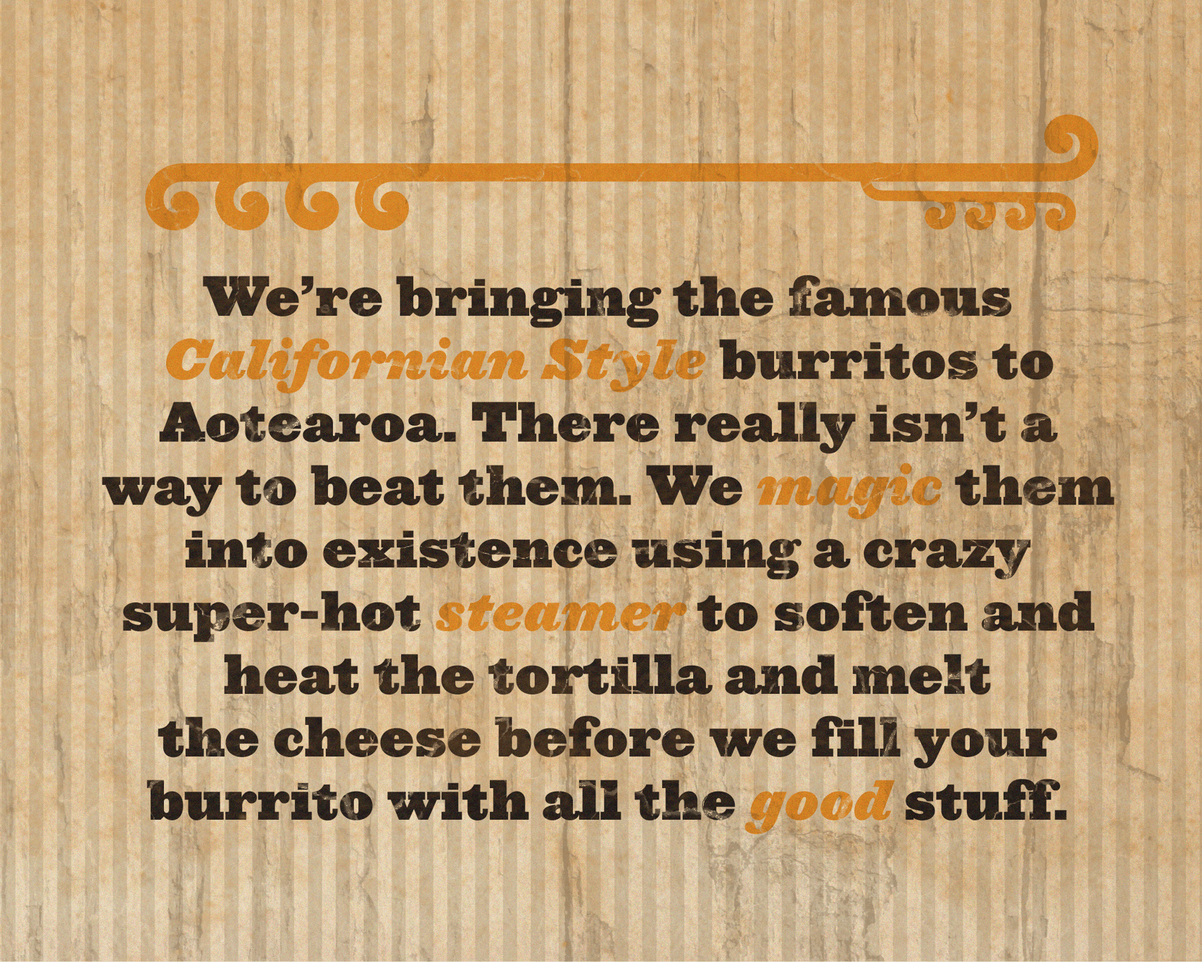
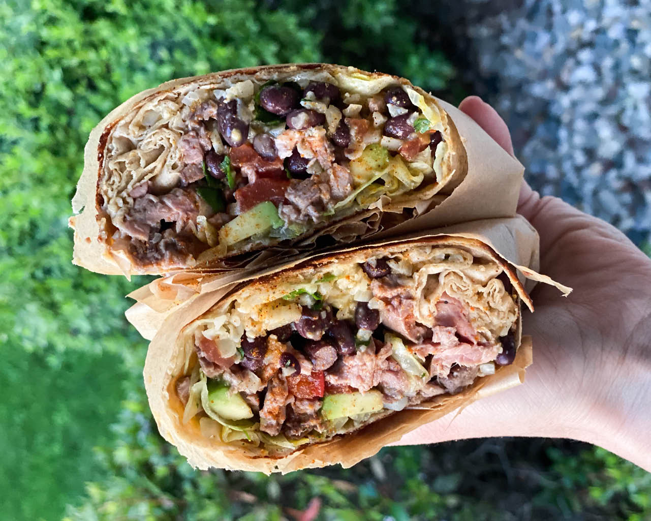
When chef Cy Besser returned to Aotearoa after several years in the US, he brought more than just kitchen skills. He came back with a deep love for the Californian-style burrito: generous, flavour-packed, and crafted with care. But Cy wasn’t interested in imitation. He wanted to create something new: a burrito experience that fused the authenticity of Mexican street food with the ingredients, influences, and energy of New Zealand.
Burrito Magic was born out of this ambition: a bespoke food truck offering burritos that felt familiar yet fresh, made with high-quality local produce and a chef’s precision. But to launch in a crowded and competitive street food scene, the brand needed to do more than taste good. It needed to stand out, to tell a story before a single bite was taken.
The brief was layered. The brand had to be recognisably 'Mexican' at a glance, yet deeply rooted in Aotearoa. It had to be bold enough to turn heads across a paddock full of food trucks, but also hold its own up close, rewarding those who took a moment to look more deeply.
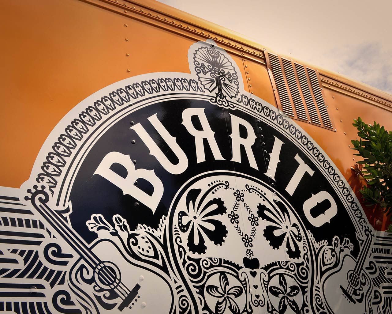
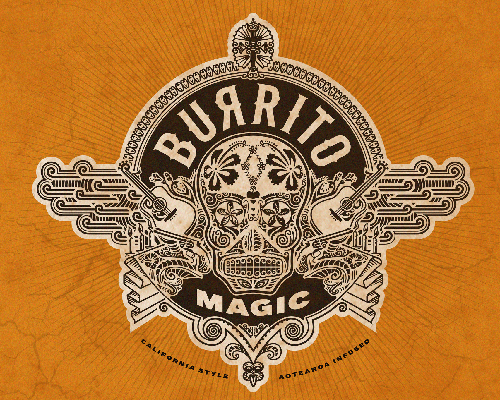
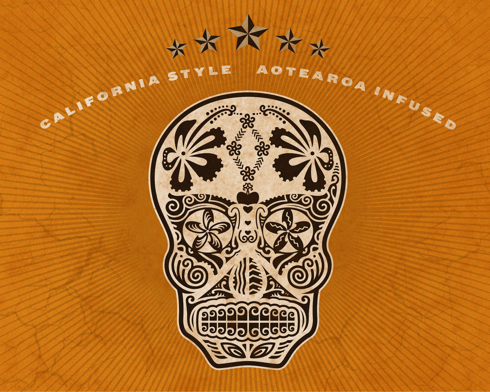
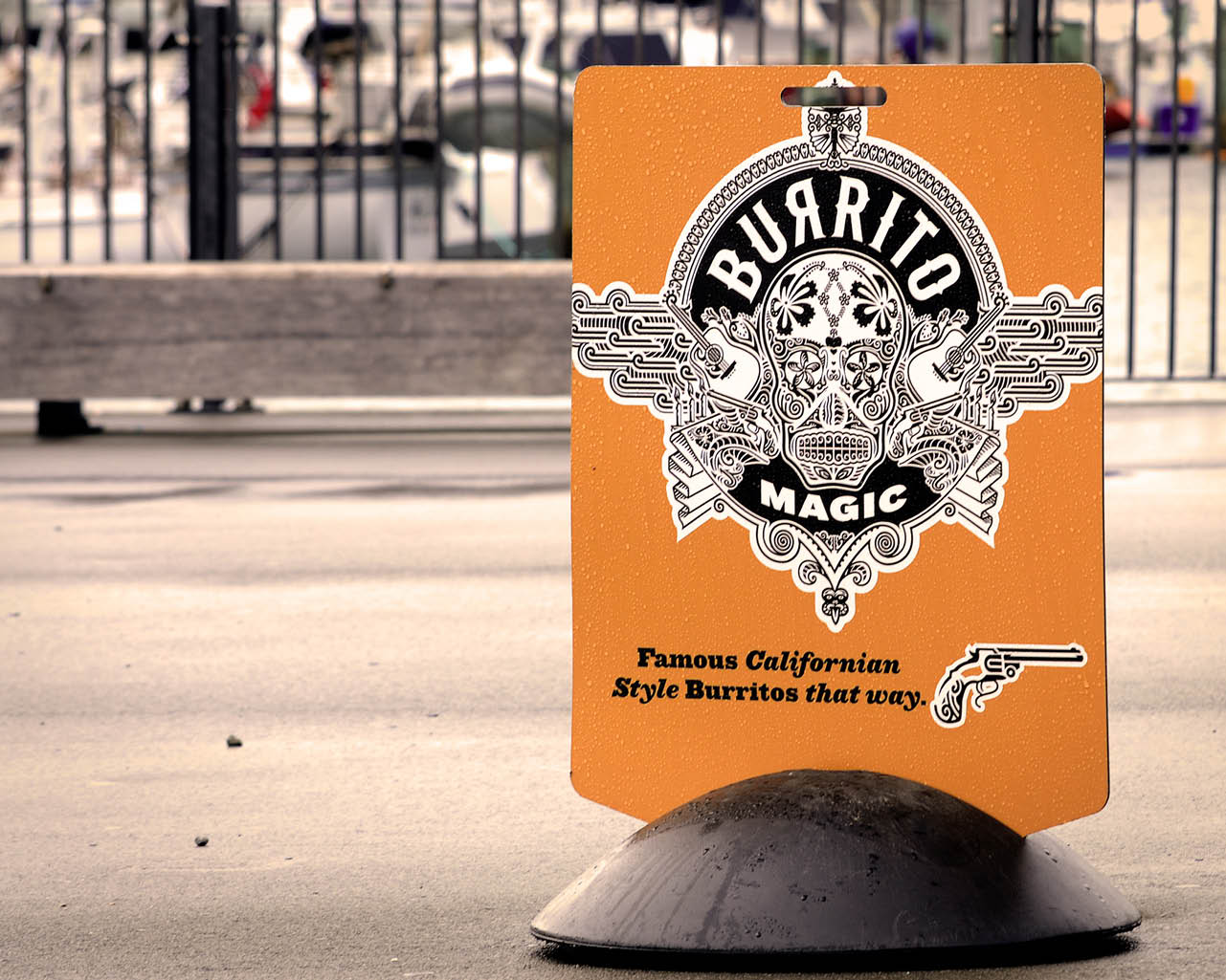
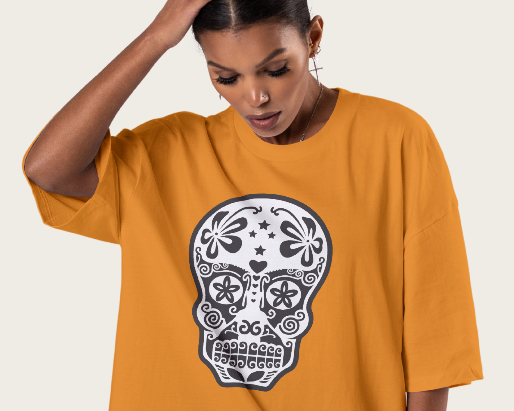
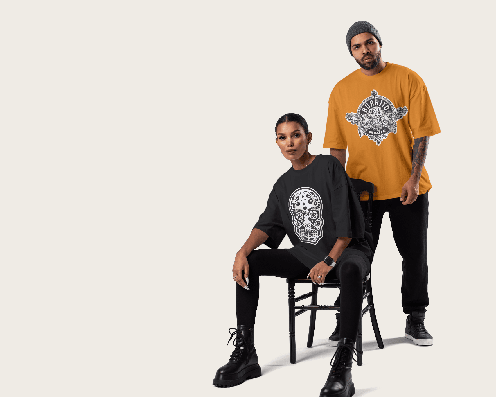
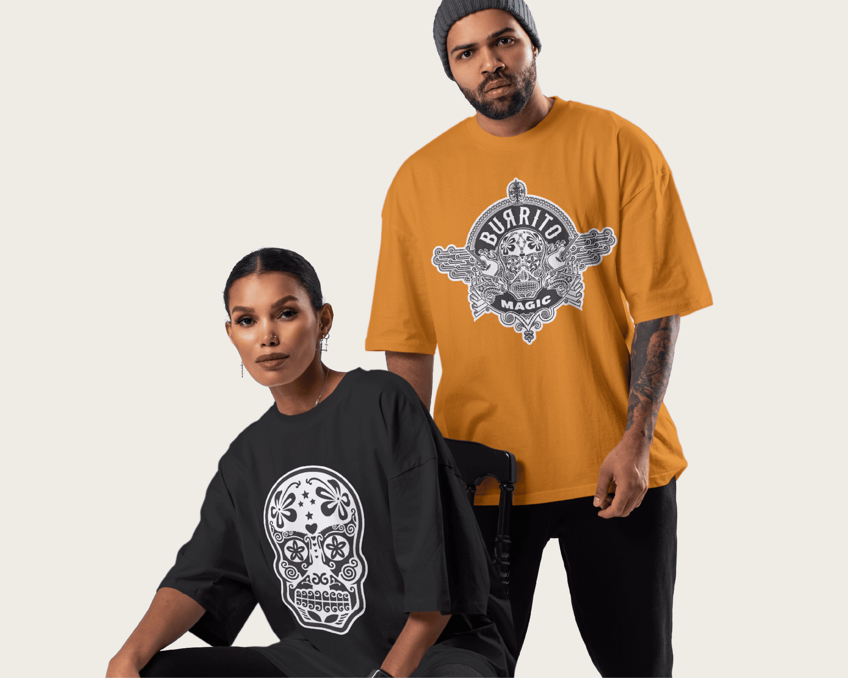
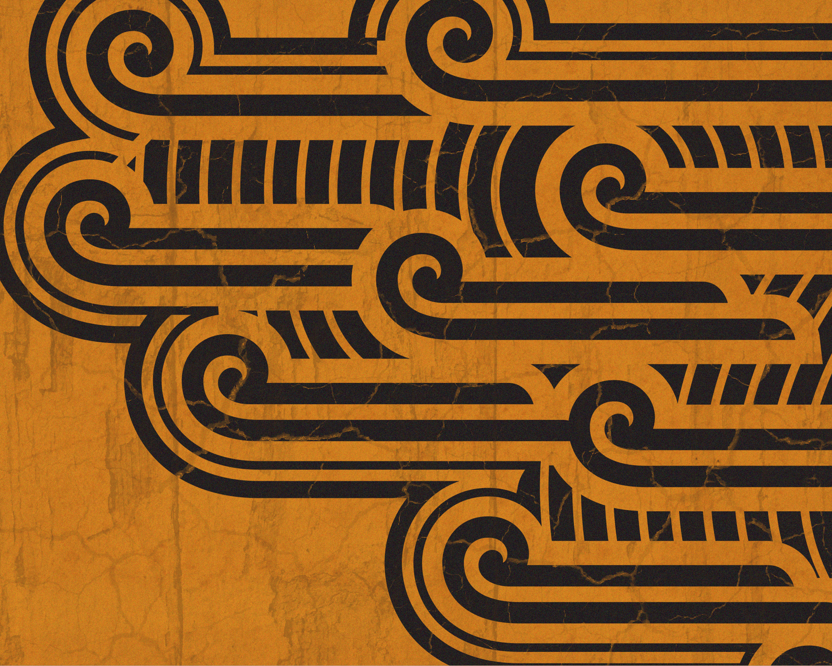
We took inspiration from one of the most iconic symbols of Mexican culture – the sugar skull – and reimagined it through an indigenous lens. The final mark still reads as a “Día de los Muertos” motif at a glance, but look again: every contour and flourish is drawn from Māori and Pacific design traditions. Kōwhaiwhai patterns, tapa textures, and symbolic forms come together in a way that honours both cultural identities; a true fusion, not a pastiche.
This approach extended across the wider visual identity: a bold colour palette, custom typography, and layered graphic assets helped position Burrito Magic as something more than a food truck. It’s a conversation starter. A symbol of authenticity, adaptation, and respect.
With Burrito Magic, Cy was doing more than serving burritos. He was sharing a personal story; one that connects cultures, honours craft, and celebrates flavour through a brand as rich and considered as the food itself.
It had to say Mexican street food at a glance — but tell a uniquely Kiwi story up close.
Burrito Magic is more than a food truck, it’s a cultural fusion told through flavour, form, and respect.
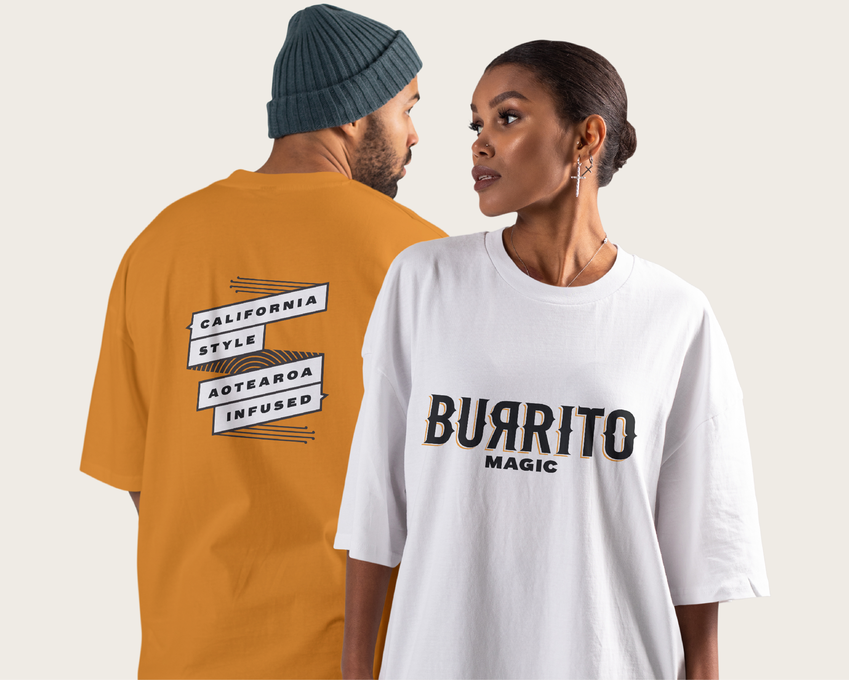
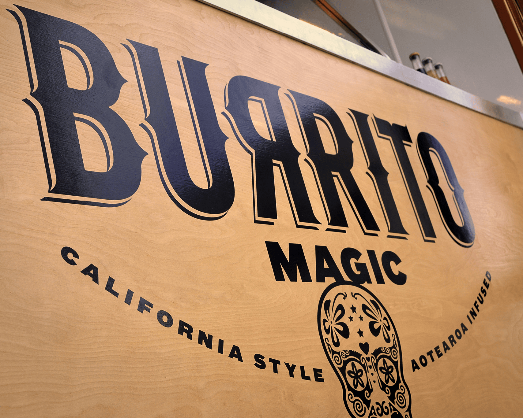
Every detail of the brand, like the food, was crafted with authenticity, boldness, and a twist of local magic.