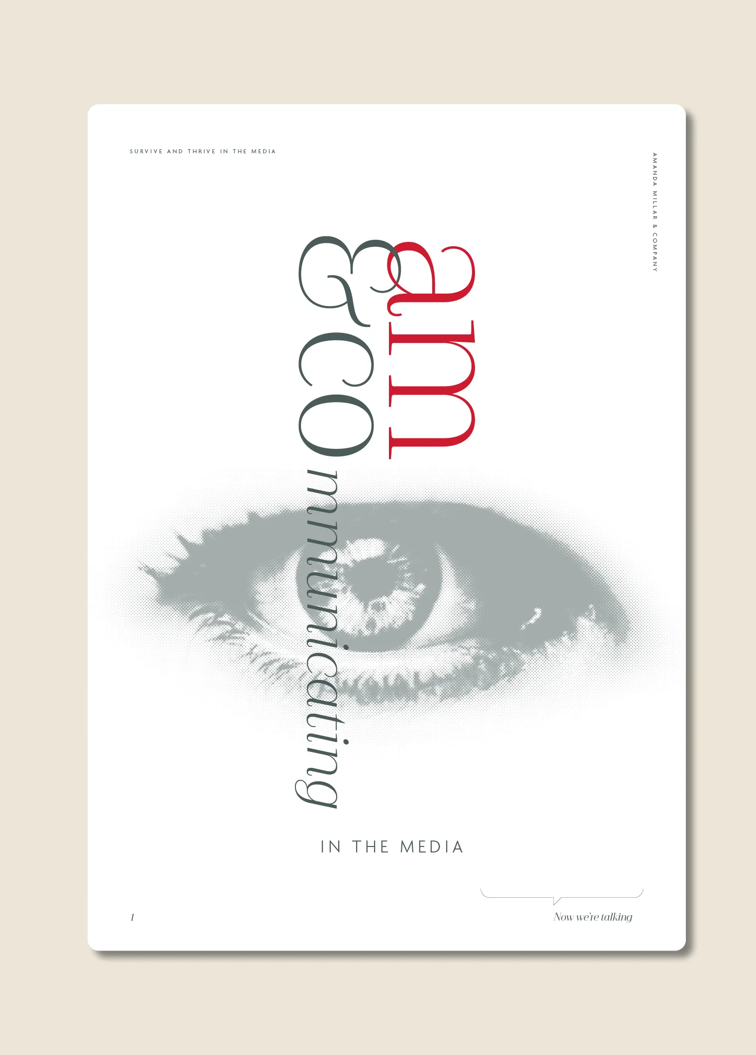
AM&Co Brand Identity and Storytelling
Now we’re talking.

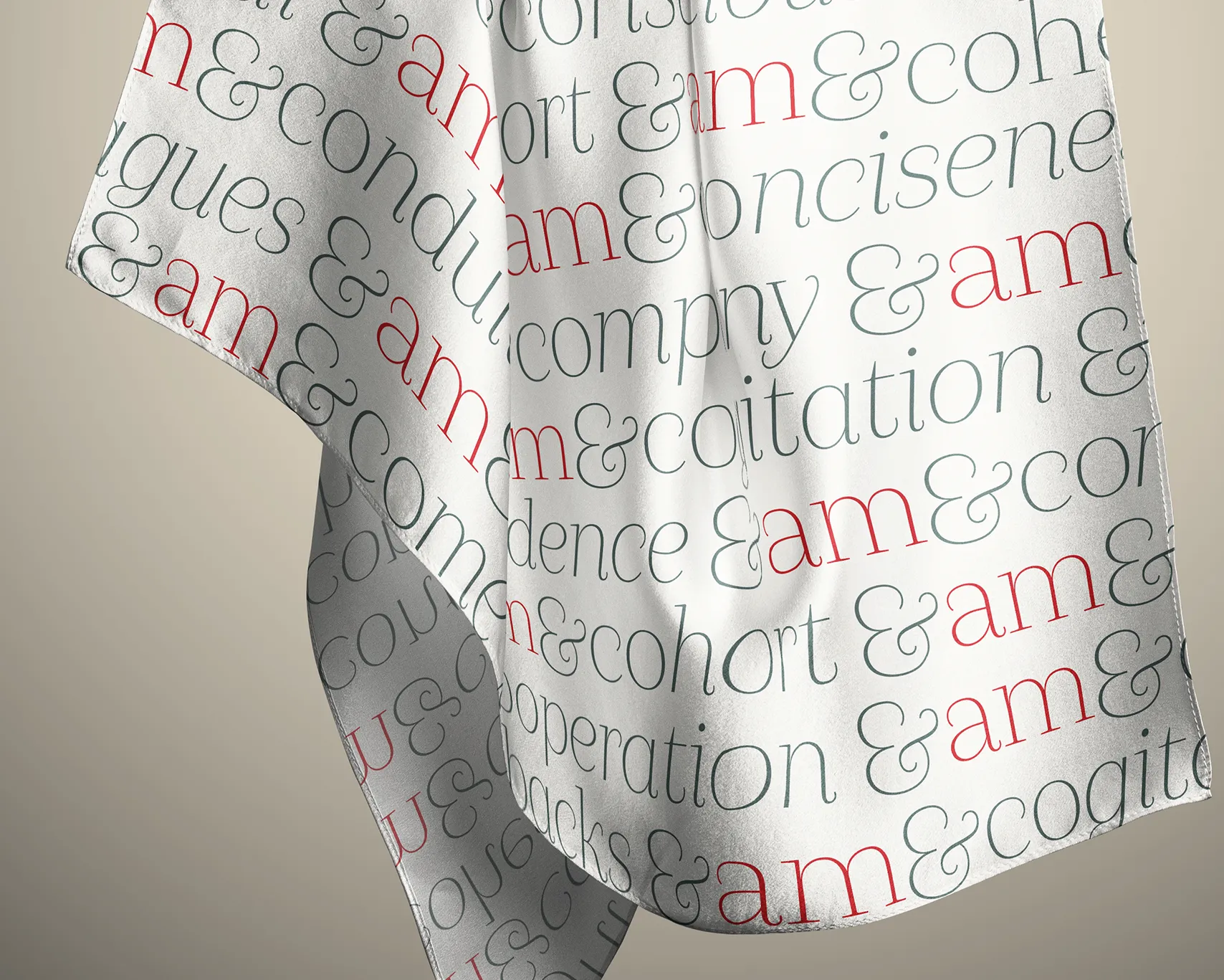
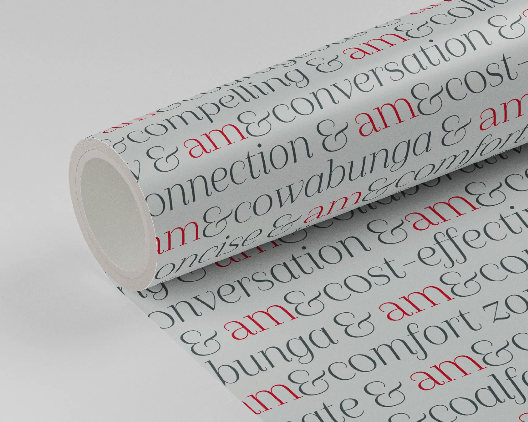
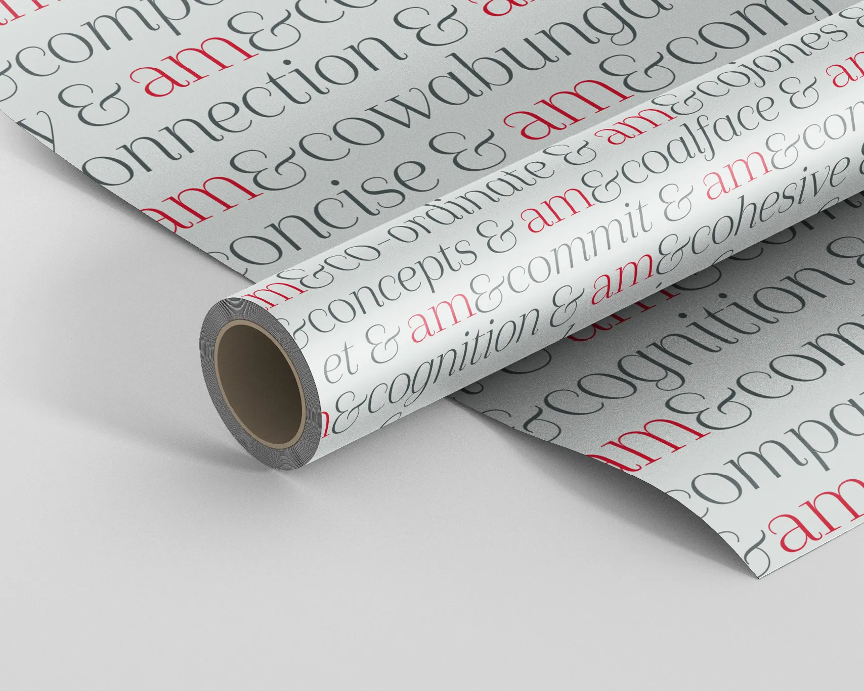
It so happens that that company name, AM&Co, became the inspiration for how the brand 'talked'. Co became the prefix to words they use daily to describe what they do and how they work.
Client
AM&Co Brand Identity and Storytelling
Project
Brand Identity, Brand Signature, Storytelling and Collateral
Location
Pōneke, Wellington
Year
2016
-
2018
Role
Designer, Art Director and Creative Director
Agency
Provenance Creative
Category
Leadership Development and Communications
Contributors
Amanda Millar – Client
Tennesee Mansford – Client
Amanda Samuel, Concept and Copywriting
Zakary Kinnaird, UI design
Scott Newlands, Production
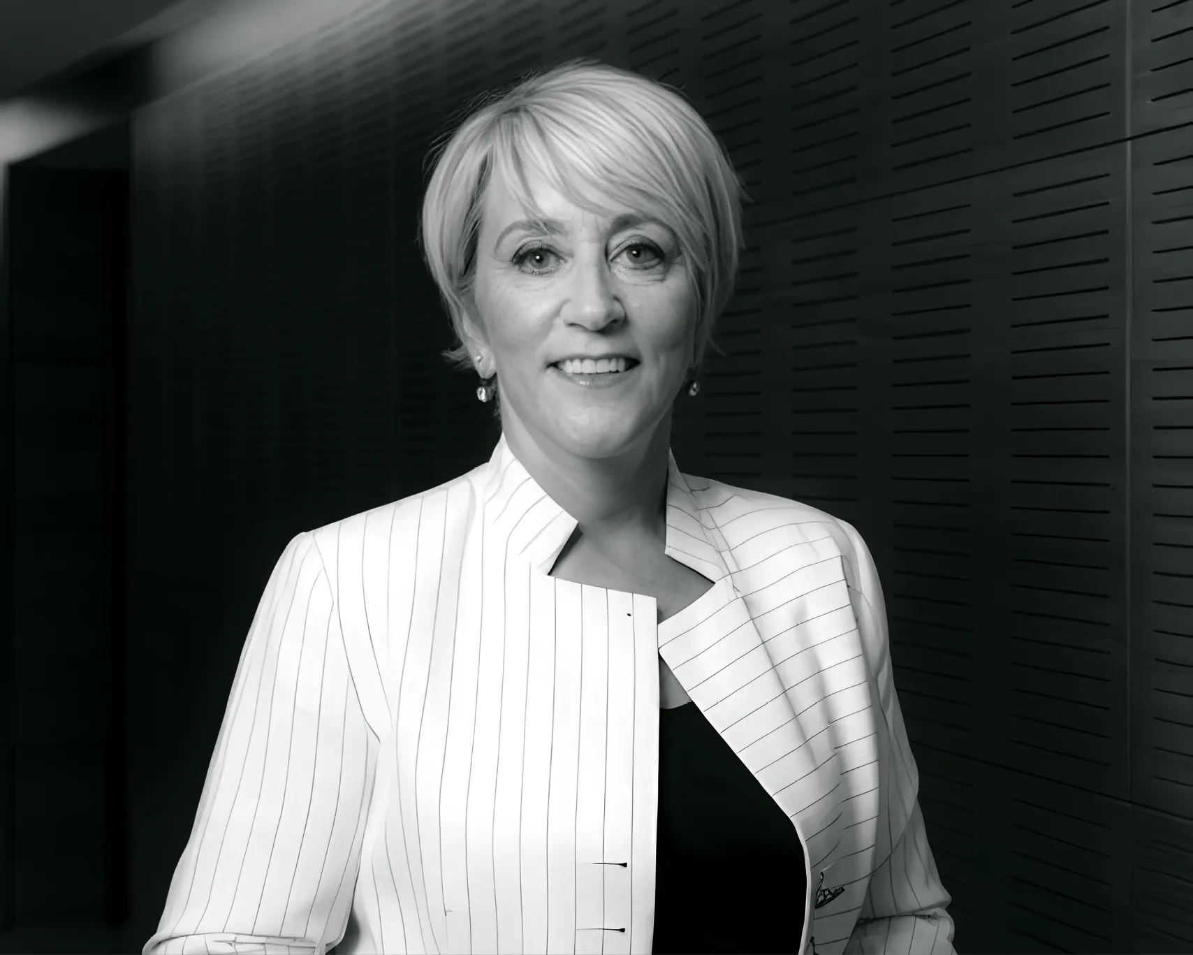
Amanda Millar had spent decades under the lights. She knew what confidence looked like on camera, and she knew exactly what panic looked like too. Over years of live crosses, difficult interviews, current affairs investigations and studio pressure, she had seen the full spectrum of human communication. Some people could command a room with a few words. Others unravelled under scrutiny.
Amanda understood both.
Part poet, part detective, she built a career helping people tell the truth about themselves with clarity, conviction and humanity. As a multi-award-winning journalist, she had spent years uncovering stories for 20/20, 60Minutes and documentaries. She was recognised as New Zealand’s best interviewer seven years running, but the real measure of her work was never the awards. It was the people she transformed.
AM&Co exists to help people find their voice when it mattered most. Leaders under pressure. Executives in the spotlight. Teams navigating difficult conversations. Businesses facing scrutiny. People who needed to communicate clearly, calmly and with authority when the stakes were high.
The challenge was to create a brand that could move beyond Amanda herself while still being deeply tied to her reputation, instincts and presence. The business was growing beyond a single personality. It needed to feel like a broader consultancy with depth, range and serious capability behind it. It needed to communicate leadership, confidence, presentation skills, stress management and media readiness without feeling clinical or corporate.
Most importantly, it needed immediate credibility.
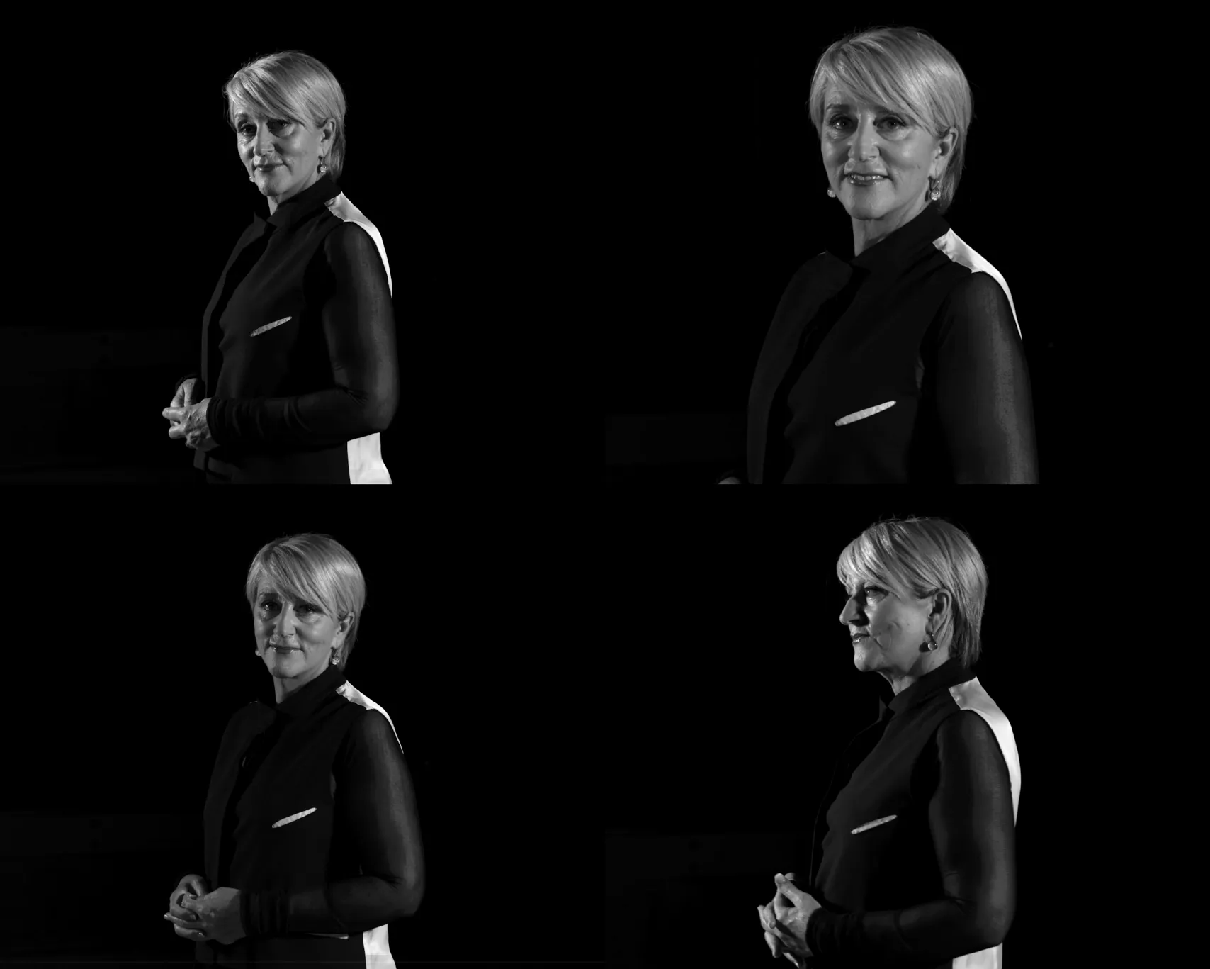
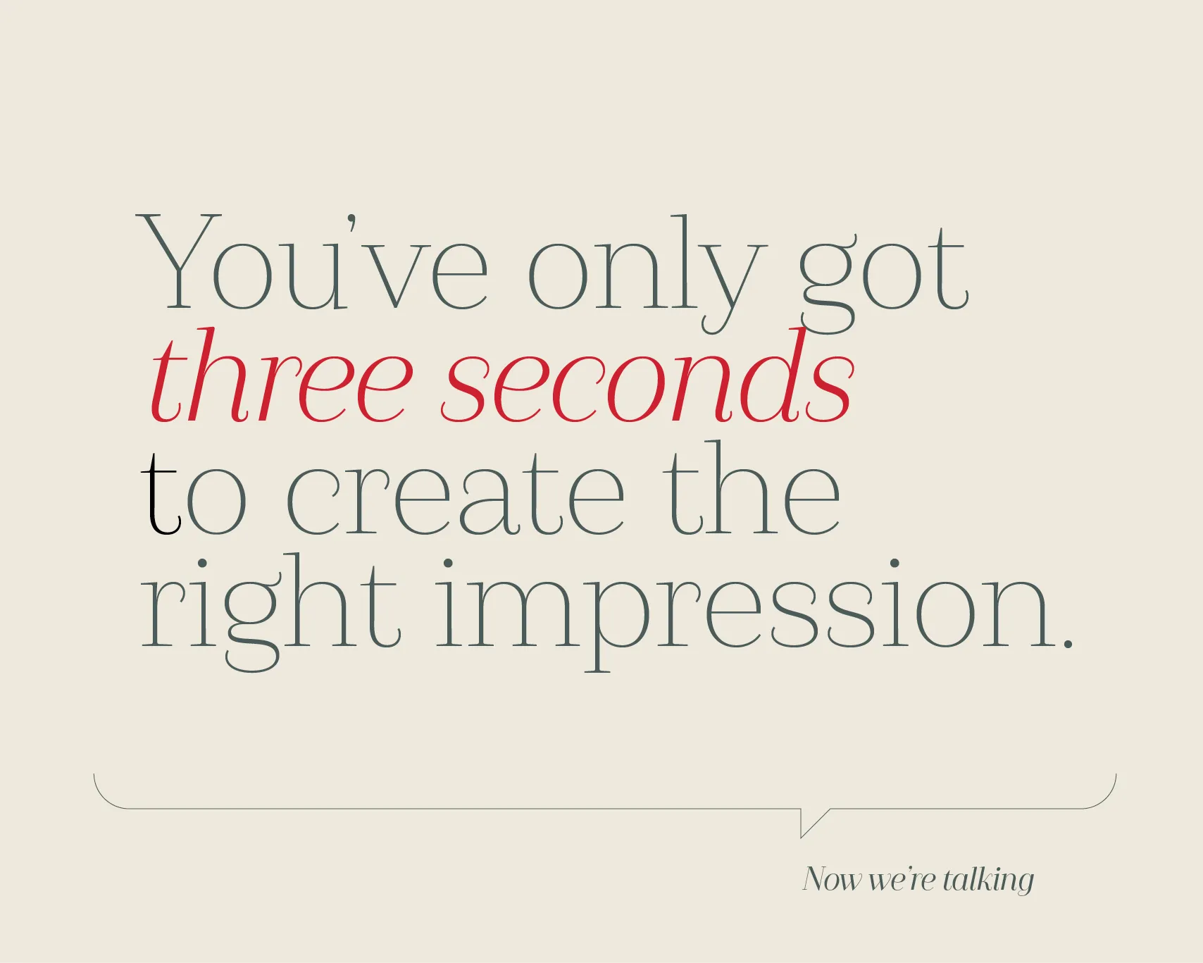
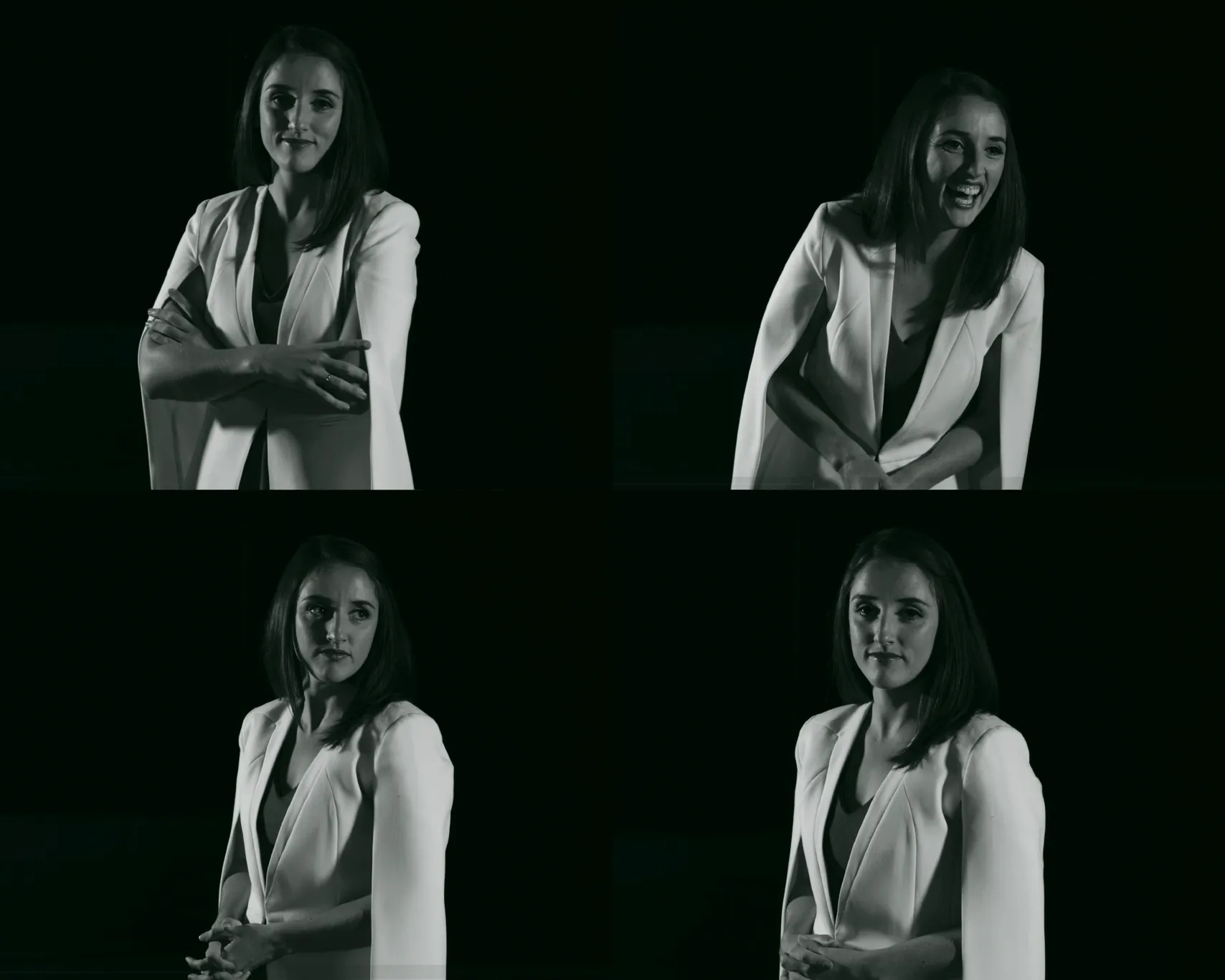
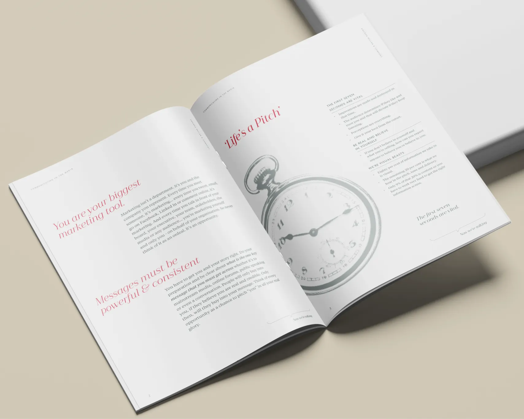
We built a brand that felt sharp, intelligent and quietly commanding. Distinctive typography gave the identity structure and authority. A restrained palette of black, white and soft neutrals was punctuated with a deliberate accent of red, a colour that hinted at urgency, pressure and performance. Moody black-and-white photography gave the business a sense of gravity and presence while still allowing space for warmth, personality and humour.
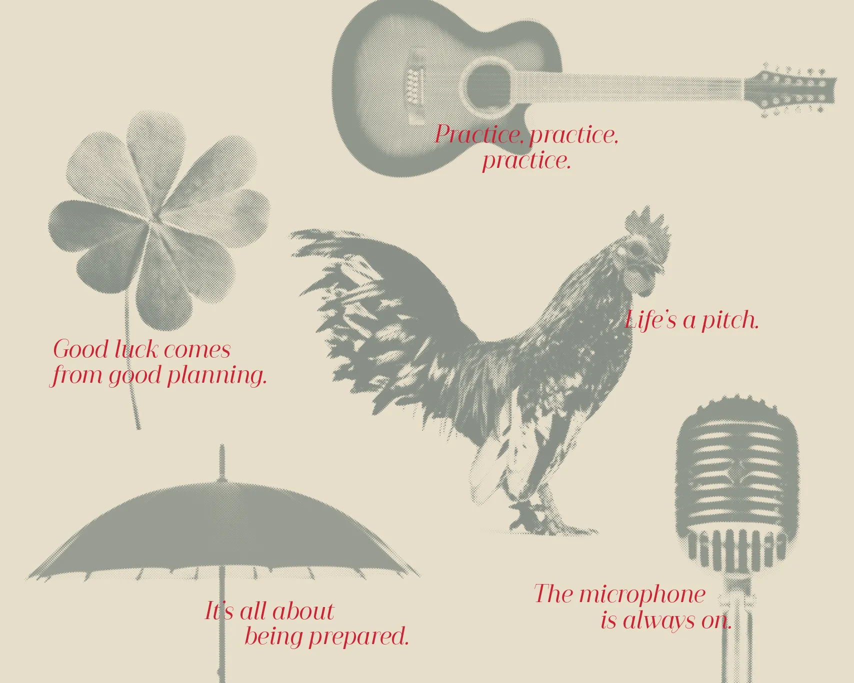
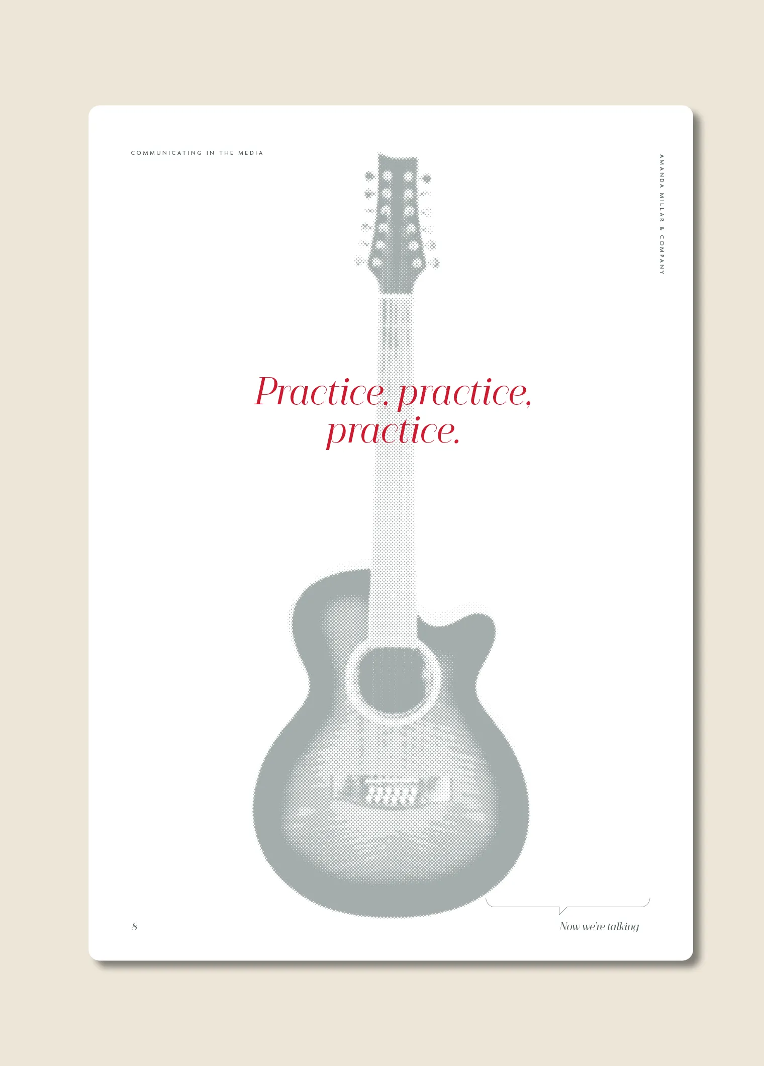
The storytelling was equally important. Amanda’s business was never simply about media training. It was about helping people find the words when the pressure was on. It was about turning ordeals into opportunities. It was about standing taller in the moments that mattered. We developed a verbal style that reflected this. Calm but direct. Human but authoritative. Professional without losing personality.
The result was a brand that could stand up to years in the spotlight. It felt credible from the outset, but never cold. It had enough professionalism to sit comfortably in boardrooms, enough character to feel memorable, and enough flexibility to grow as the business expanded.
AM&Co became more than a reflection of one woman’s reputation. It became a confident, enduring platform for helping others find theirs.


The AM&Co team genuinely care about the real you and how you can best express that.


We worked with Amanda and her team to develop a unique voice, and deliver that with intelligence and a touch of humour.


The team have become renowned for their no-nonsense approach, but one that leaves people leaving their programme inspired and confident.